Presentation Power: Build Your Territory Map in PowerPoint
Written by: Clyde Christian Anderson
Why Visualize Territories in PowerPoint?
Learning how to create a territory map in PowerPoint is a critical skill for sales managers, retail executives, and analysts. It's the fastest way to turn complex geographic data into a clear, compelling visual story. Here's how to get started:
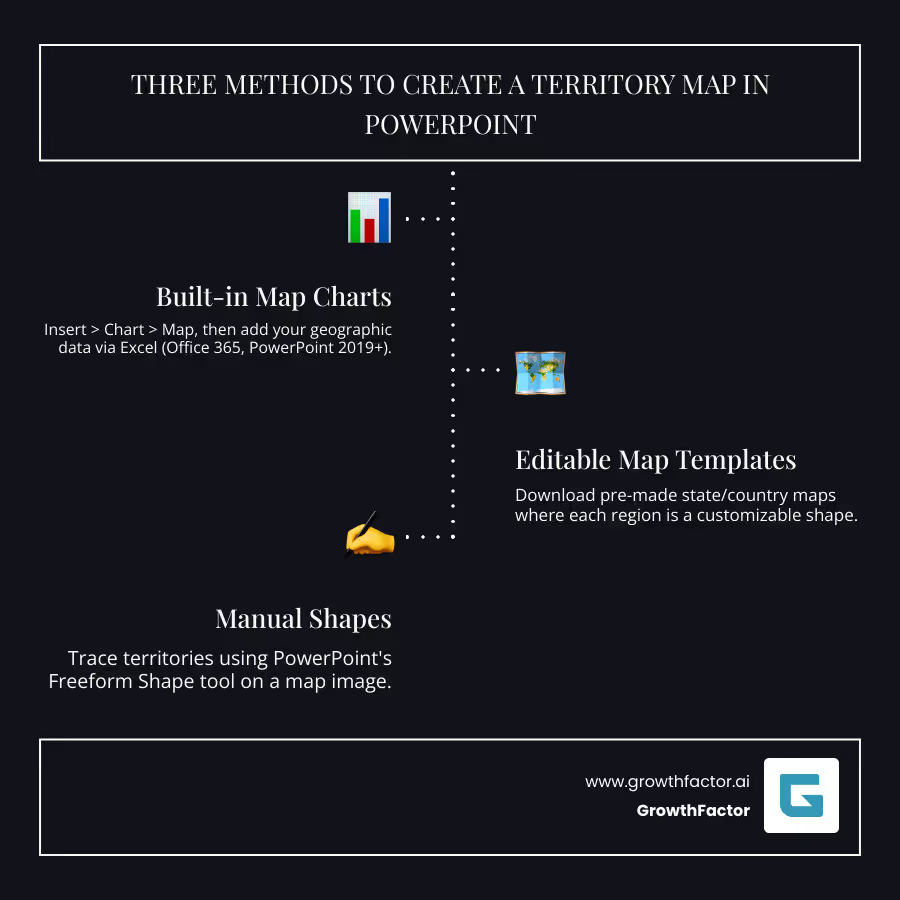
Quick Answer: Three Methods to Create a Territory Map in PowerPoint
- Built-in Map Charts (Office 365, PowerPoint 2019+): Use Insert > Chart > Map and add your data via the linked Excel sheet.
- Editable Map Templates: Download pre-made maps where each region is a customizable shape.
- Manual Shapes: Trace custom territories on a map image using PowerPoint's Freeform Shape tool.
Spreadsheets full of sales figures and location data can be tedious and difficult to interpret. Territory maps solve this problem by changing raw data into visual stories. They help you see where a company operates, evaluate expansion opportunities, and present market penetration data effectively. With a map, you can instantly spot which regions are performing well and which need attention.
PowerPoint offers surprisingly powerful tools for this. Newer versions include a built-in 'Maps' feature, while older versions can use downloadable templates or manual drawing tools. The benefit is clear: PowerPoint maps make it easier to demonstrate relationships and patterns across different regions.
I'm Clyde Christian Anderson, founder of GrowthFactor.ai. My experience in retail real estate analysis has shown me how vital the right visualization is for decision-making. This guide will walk you through each method to bring your geographic data to life.

Method 1: Using PowerPoint's Built-in Map Charts
If you have Microsoft 365, PowerPoint 2019, or newer, you have access to the built-in Map chart type. This feature transforms geographic data into a professional map without needing advanced design skills, making it a time-saver for presenting location-based insights.
Step-by-Step: Inserting Your First Map
- Steer to the slide where you want the map.
- Go to the Insert tab, click the Chart icon, and select Map from the list on the left.
- Click OK. PowerPoint will insert a default map and open an Excel spreadsheet.

This spreadsheet is where you'll input your data to customize the map. The default includes sample locations, which you will replace with your own.
Preparing and Entering Your Geographic Data
An effective map requires clean, organized data. You need two columns: one for geographic locations (countries, states, regions, or postal codes) and one for corresponding numerical values (like sales figures or population).
In the Excel sheet that opens, replace the sample data:
- Location column: Enter the names of your geographic regions. Use full names (e.g., "Texas" instead of "TX") to avoid ambiguity.
- Value column: Enter the numerical data for each location. These numbers determine the color-coding on your map, creating a heatmap effect where higher values get darker shades.
For example, to map countries by population using data from Statista on population, you'd list country names in the Location column and their populations in the Value column. If your data exceeds the default rows, right-click the map, choose "Select Data," and adjust the "Chart Data Range" in Excel to include all your data. This preparation is the foundation of effective Retail Market Research.
Customizing Your Map's Appearance
Once your data is in, you can customize the map's design. Select the map to reveal the Chart Design and Format tabs in the ribbon.

- Colors: Use the Chart Design tab to change the overall color scheme. For fine-tuning, right-click a region, select "Format Data Series," and adjust the Series Color to create a custom gradient.
- Labels: Click the "+" icon next to the map and check "Data Labels" to show region names or values. Customize what's displayed to keep the map clean.
- Legend: The legend explains your color scale. You can click to select it, then move it or use the Format tab to change its appearance.
Good map design prioritizes clarity. Use readable fonts and a logical color scheme to ensure your message is easily understood.
Understanding the Limitations
While powerful, the built-in map feature has some limitations to keep in mind:
- Internet Required: It needs an active internet connection to function, as it relies on Bing Maps to render the visuals.
- Bing Dependency: Your map is limited to the geographic data and rendering capabilities of Bing Maps.
- Potential for Crashes: Complex data with hundreds of regions can sometimes cause PowerPoint to crash. Save your work often.
- No Ungrouping: You cannot break the map chart into individual, editable shapes for custom manipulation.
- Single Region Type: You can only map one level of geography at a time (e.g., all states or all countries, but not a mix).
- Copyright Notice: A small Bing/Microsoft copyright notice appears by default. You can cover it with a white rectangle if needed.
Method 2: How to create a territory map in PowerPoint with Shapes and Templates
If you're using an older PowerPoint version (pre-2019) or need more design control, using shapes and templates is the best approach. This method offers maximum flexibility, as you are not dependent on an internet connection or built-in data interpretation.
Using Editable Map Templates
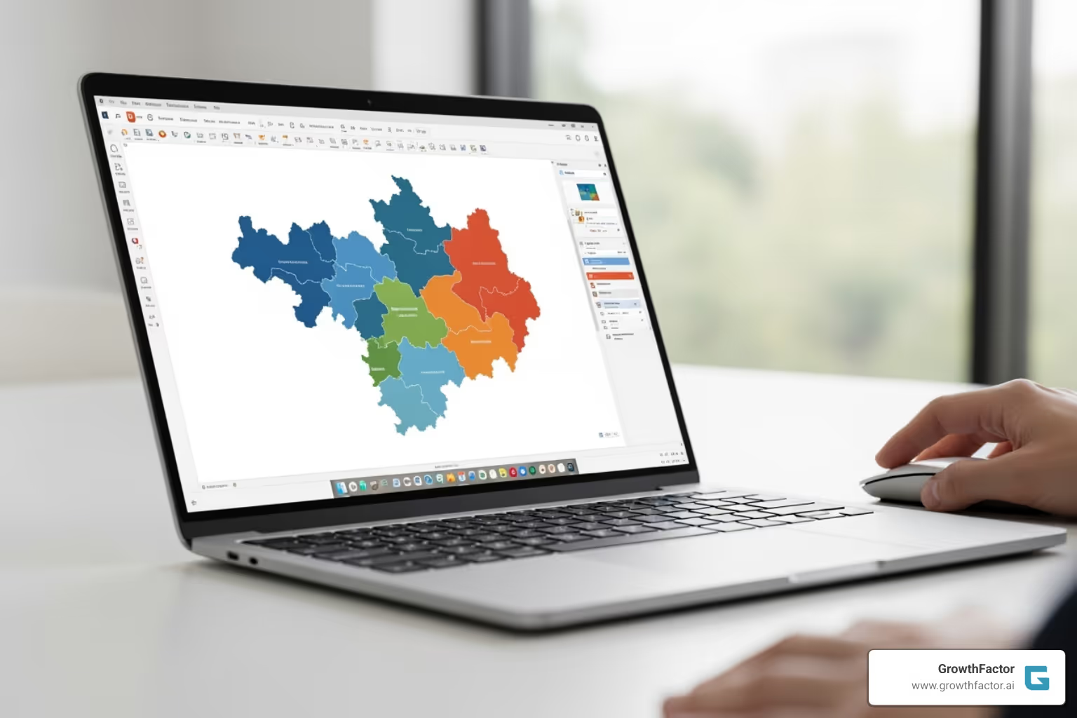
Editable map templates are pre-made PowerPoint files where each geographic region is an individual, customizable shape. This gives you a significant head start.
- Find a Template: You can find free, high-quality templates online, including maps for the US, Europe, and other regions on Microsoft's official templates site. For more advanced use, look for SVG (Scalable Vector Graphics) maps, which offer crystal-clear quality at any size and can be ungrouped into individual shapes.
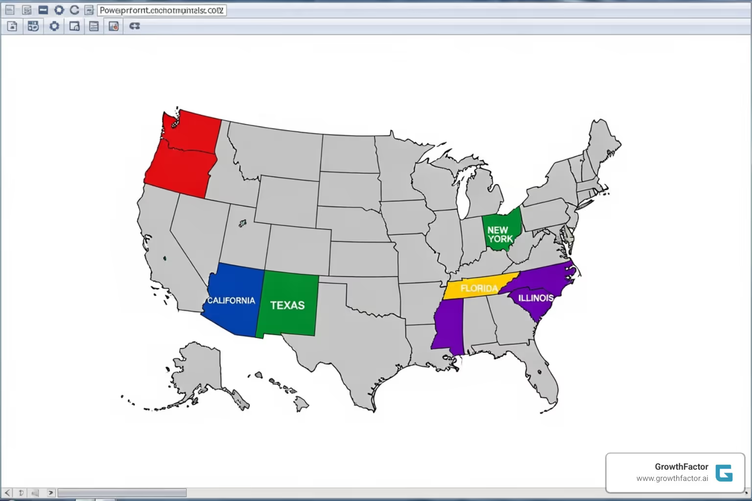
- Customize the Shapes: Once you open the template, click on any region (like a state or country) to select it as a separate shape. Use the Shape Fill tool to change its color. To define a territory spanning multiple areas, hold the Shift key while clicking each one, then color them all at once.
- Group the Final Map: After coloring your territories and adding labels, select all the elements, right-click, and choose "Group." This turns your map into a single object, making it easy to move, resize, or copy. Hold Shift while resizing to maintain the map's proportions.
This approach is great for Retail Market Research, where visual clarity is key.

How to create a territory map in PowerPoint using manual shapes
When you need to define custom territories that don't follow standard boundaries (like delivery zones or franchise areas), manual tracing is the solution.
- Start with a Base Image: Insert a clear map image onto your slide. This will be your tracing guide.
- Use the Freeform Shape Tool: Go to the Insert tab, click Shapes, and select the Freeform Shape tool. This tool lets you draw custom shapes by clicking to create points.
- Trace Your Territories: Click along the boundary of your desired territory. To close the shape, click back on your starting point. PowerPoint will create a solid shape.
- Customize and Layer: You can now fill the shape with color, adjust its transparency, and add an outline. This method allows you to layer shapes to show overlapping zones or create unique boundaries that would be impossible with other methods.
This manual approach requires no data connection and offers complete creative freedom. It's particularly useful for specialized projects like Site Demographics: Complete Guide analysis, where custom trade areas are often required.
Advanced Techniques for Your PowerPoint Territory Map
Once you've mastered the basics, advanced techniques can transform your maps into dynamic storytelling tools that engage your audience.
How to create a territory map in PowerPoint with interactivity
Adding interactivity invites your audience to engage with the data. Instead of a static image, your map becomes a dashboard.
- Use Hyperlinks for Drill-Downs: Make any map region a clickable gateway to more information. Right-click a shape, select "Hyperlink," and link to another slide with detailed data, an external Excel file, or a relevant website. This keeps your main slide clean while providing depth.
- Employ Animations and Triggers: Use the Animation Pane to control how information appears. A "Fade" animation can reveal territories one by one as you discuss them. Triggers take this further: set up an action so that clicking a region makes a text box with sales figures appear. This creates a guided, interactive narrative.
- Create Zoom and Focus Effects: To guide your audience from a national overview to a specific city, create a sequence of slides that progressively magnify a region. You can also use fade effects to dim all other territories when focusing on a single one, eliminating distractions. These techniques are valuable for presenting Location Intelligence: Retail Guide insights, which often require both macro and micro views.
The Role of AI in Modern Territory Mapping
The future of territory mapping lies in how we analyze data before it even reaches PowerPoint. AI is revolutionizing this process.
Traditionally, preparing geographic and sales data is a manual, time-consuming task. Modern AI tools can analyze vast datasets in seconds, uncovering patterns that humans might miss. For retail, this means AI can identify why certain territories are outperforming others by correlating sales with demographic data or competitor proximity.
Key benefits of AI in mapping include:
- Pattern Recognition: AI can automatically suggest which territories to highlight, recommend color schemes based on performance, and flag anomalies like a sudden sales drop.
- AI-Driven Optimization: For territory planning, AI can suggest optimal boundaries by factoring in sales potential, travel times, and workload balance, setting sales teams up for success.
- Spreadsheet Automation: AI can automatically clean and standardize messy data (e.g., recognizing "NY" and "New York" as the same place), formatting it perfectly for PowerPoint's map feature. This frees you to focus on strategy.
The true value of AI Location Intelligence is improved decision-making. Combining PowerPoint's visuals with AI-powered insights tells a data-driven story about where to focus resources and find the next growth opportunities.
Best Practices for Designing and Presenting Your Map
Creating the map is only half the battle. A well-designed and presented map is what drives decisions. Follow these best practices to ensure your map is effective.
- Accept Simplicity: A cluttered map is an ineffective map. Focus only on the essential data that supports your core message. If you're showing sales performance, don't overload the visual with unrelated demographic data.
- Prioritize Readability: Use bold, clear fonts for labels that stand out against your map's colors. Ensure text is large enough to be read easily, even if it means being selective about which regions you label.
- Maintain Color Consistency: Establish a clear visual language with your color palette. If dark blue means high performance on one slide, it should mean the same thing throughout your presentation. Align colors with your brand for a cohesive, professional look.
- Tell a Story: Your map should answer a question or solve a problem. Provide context before diving into the data. Use animations or callouts to guide your audience's attention to the most important insights, turning a static visual into a dynamic narrative.
- Engage Your Audience: Ask questions that prompt viewers to analyze the map. For example, "What patterns do you notice in our Western territories?" This transforms passive viewing into active participation in your Site Selection Strategy.
- Practice Your Delivery: Test every animation and hyperlink before you present. Use PowerPoint's Presenter View to see your notes and rehearse the flow until it feels natural. Be prepared to answer questions, as a great map will always spark curiosity.
Frequently Asked Questions about PowerPoint Territory Maps
Here are answers to some of the most common questions about creating territory maps in PowerPoint.
Can I map specific city locations or addresses in PowerPoint?
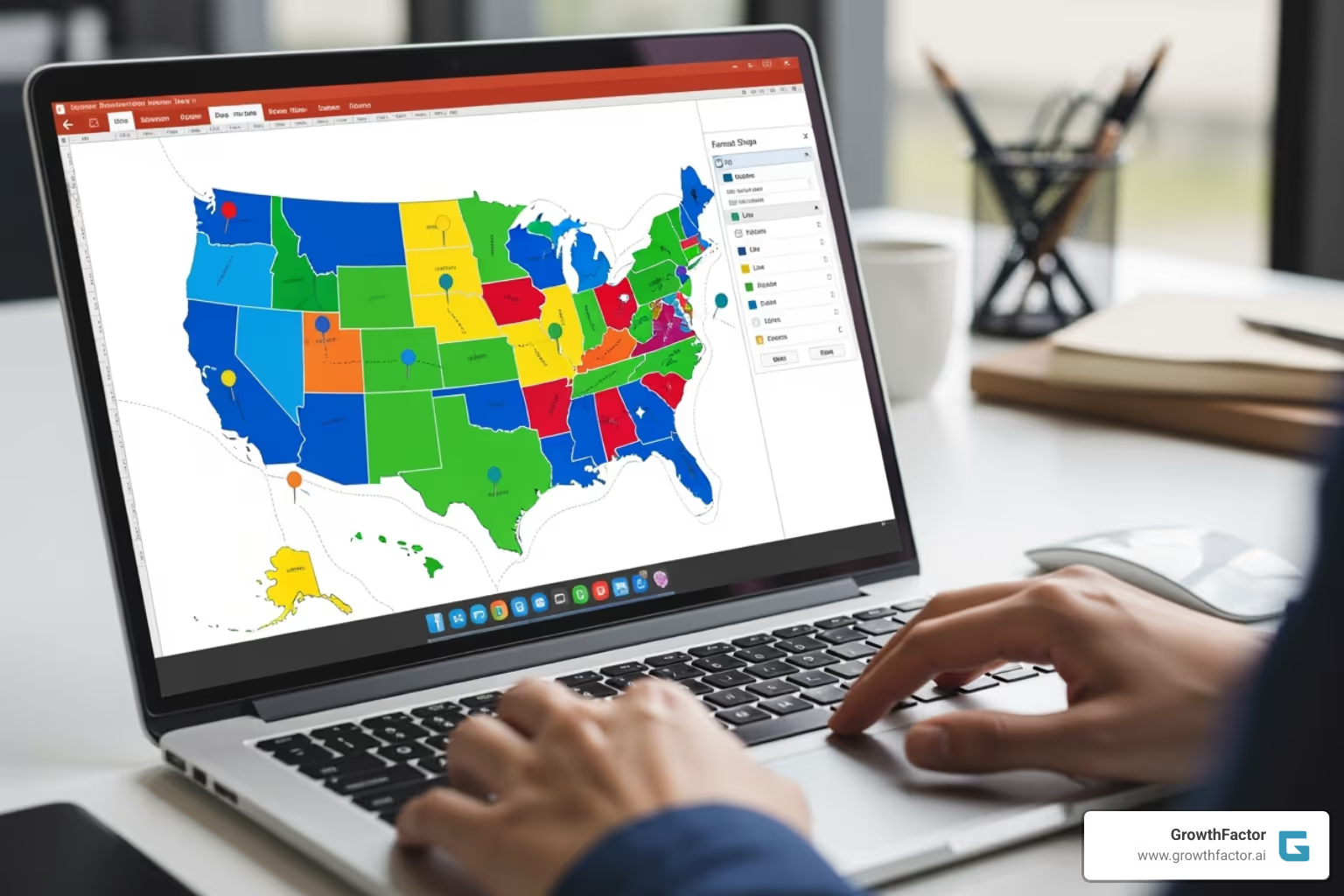
No, the built-in Map Chart is designed for regions (countries, states, postal codes), not specific points like street addresses. To mark a city, you must manually add a shape (like a circle or pin icon) and place it on the map. Group the shape with your map so it moves and resizes correctly.
Why is my map not showing a specific region I entered?
This usually happens for one of a few reasons:
- Typos or Ambiguity: Check for spelling errors. For ambiguous names like "Washington," add more detail (e.g., "Washington State" or "Washington, USA"). Using full names is always safer than abbreviations.
- Internet Connection: The map feature requires an internet connection to fetch data from Bing Maps. Ensure you are online.
- Incompatible Regions: You cannot mix different region types (like countries and cities) in the same map chart.
How do I create a territory map in an older version of PowerPoint (pre-2019)?
Since older versions lack the built-in Map Chart, you have two main options:
- Use Editable Map Templates: Download a PowerPoint file where each region is a separate, colorable shape. You can find many online, including on Microsoft's official templates site.
- Trace Manually: Insert a map image and use the Freeform Shape tool (under Insert > Shapes) to trace your custom territories. This offers maximum flexibility for unique boundaries.
Both methods are effective for learning how to create a territory map in PowerPoint without the newest features.
Conclusion: From Data to Decision with Powerful Maps
Learning how to create a territory map in PowerPoint is about turning spreadsheets into visual stories that drive clear business decisions. Whether you use the speedy built-in charts, flexible templates, or custom-drawn shapes, you are building a bridge between raw data and actionable insight. The versatility of PowerPoint ensures there is a method that fits your needs, regardless of your software version.
A well-designed map can reveal underserved markets, highlight top-performing regions, and identify the perfect location for a new store. It transforms data visualization into true business intelligence. By adding interactivity and leveraging AI for deeper analysis, you can create presentations that are not just informative but genuinely strategic.
The techniques in this guide provide a strong foundation for creating effective maps. However, for retail real estate professionals looking to move beyond presentations and build a comprehensive, AI-driven site selection strategy, specialized tools are essential.
GrowthFactor provides an all-in-one platform designed for retail real estate. Our AI-improved tools streamline everything from Retail Site Selection Analysis to deal tracking, integrating data analysis and visualization into a seamless workflow. Instead of juggling spreadsheets, you can move from data to decision with confidence and speed.
Explore our flexible plans and Market Evaluation services to see how GrowthFactor can turn your location intelligence into a competitive advantage.
Citations
The human algorithm
Request Your demo
Schedule meeting
Or submit your information below and we'll be in touch to schedule.
